Visual storytelling: MuLondon
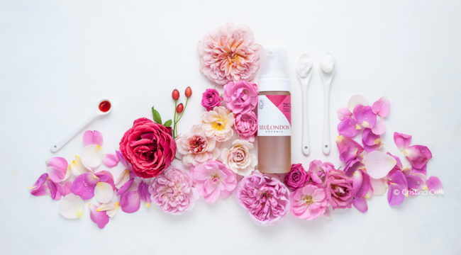
Over a year ago MuLondon contacted me to see if I’d be interested in creating a range of images for their rebrand, and I’m thrilled to finally show you some of the images I created for them. I love working with ethical brands passionate about their values and products quality, so I was delighted to be part of this collaboration.
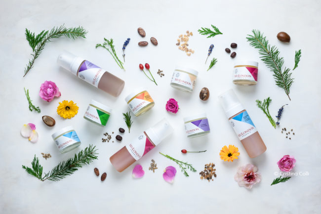
Boris, the founder, is a modern apothecary who cares about using pure, organic natural ingredients for all MuLondon moisturisers and cleansers, which are also free of any artificial preservatives, fragrances or emulsifiers.
Pure essential oils and herbal remedies naturally scent and preserve the products, and the company doesn’t test on animals – which is very important to me.
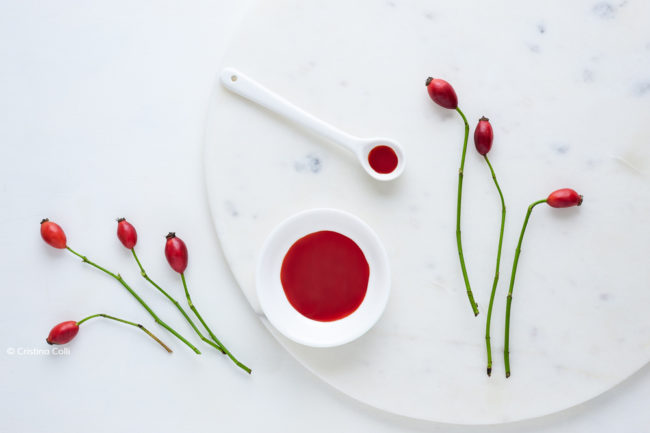
I was excited to work on this project: the products are excellent quality and ethical, flowers and plants are my favourite photography subjects, and my artistic vision was in line with MuLondon’s – a dream collaboration!
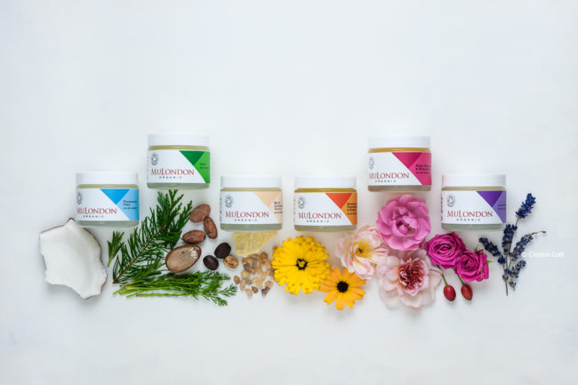
Effective visual storytelling takes time and thought, and this is especially true when you want to create a series of images that tell the same story.
Each image needs to constantly communicate the same message, albeit with different nuances. This means having a clear understanding of the brief, brainstorming ideas to best represent the message, and also creating one or more mood boards to have a visual reference for the desired feel and look of the images.
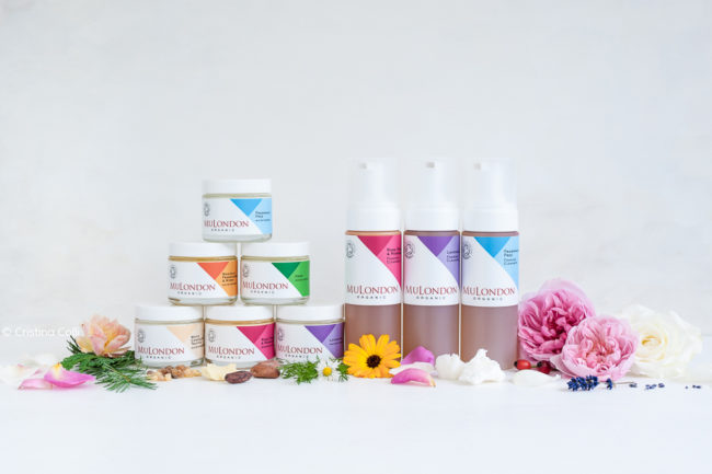
In MuLondon’s case, all photographs need to translate the overall keywords of the brand, obviously, but each skincare range has its own specific set of keywords too, mostly based on the ingredients used, type of skin they’re aimed at, and feel and scent of the product.
This meant creating a visual story for each product, based on the specific keywords, that nevertheless would harmoniously fit within the main story of the brand.

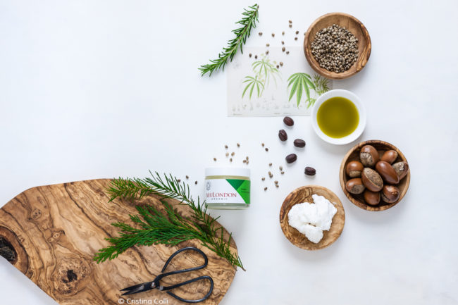
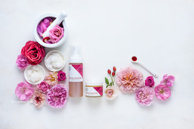
After the brainstorming phase, we used Pinterest to share images that reflected each keyword, and the result was a massive moodboard which included textures, colours, materials, and props.
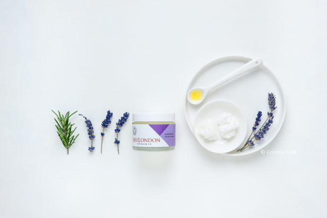
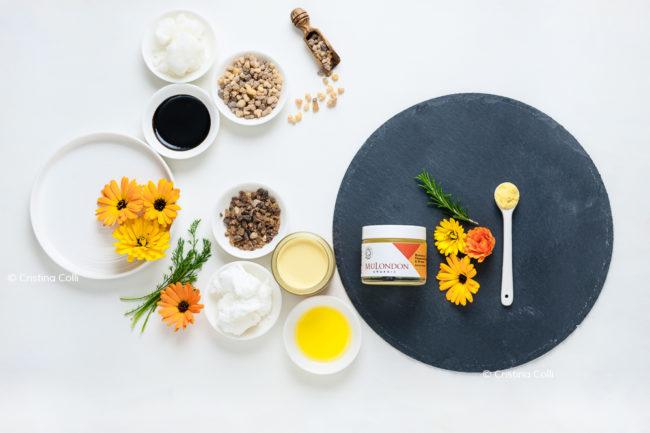
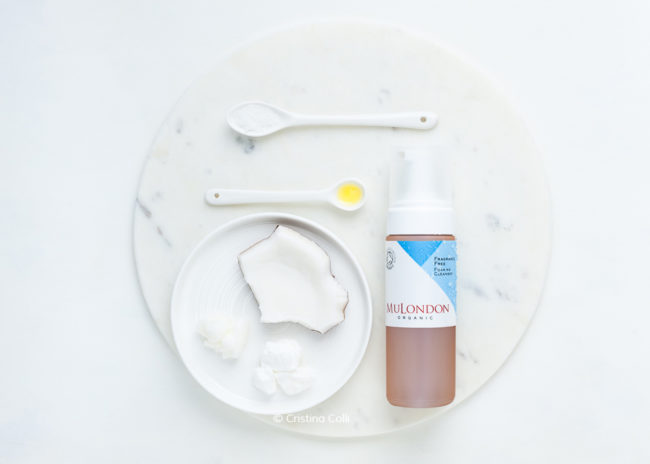
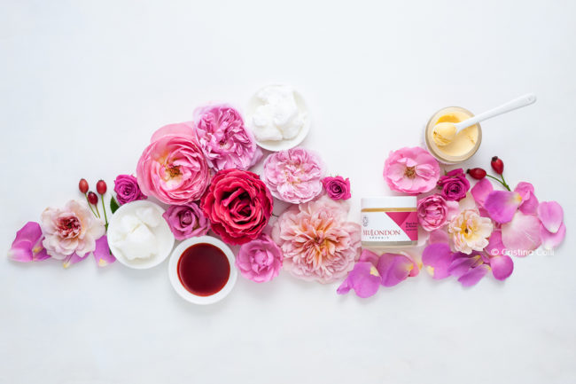
I painted a backdrop for the images, using mostly off-whites to create a light texture, and chose props with simple shapes and natural textures, such as ceramic, wood, and slate.
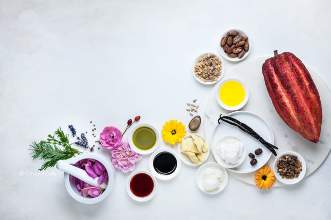
The mortar and pestle, boards, bottles, bowls, and spoons, all hint at the handmade nature of the skincare. Together with the botanical prints, they evoke the idea of an apothecary using natural herbal ingredients, but with a modern, fresh look in line with the rebranding.
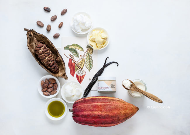
It was great fun to use all the natural ingredients as props – I’d never seen a cocoa pod up close, they’re beautiful!
I enjoyed working with such a variety of colours and textures – a wonderful mix of simple and exotic that I found really inspiring.
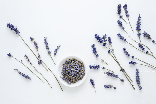
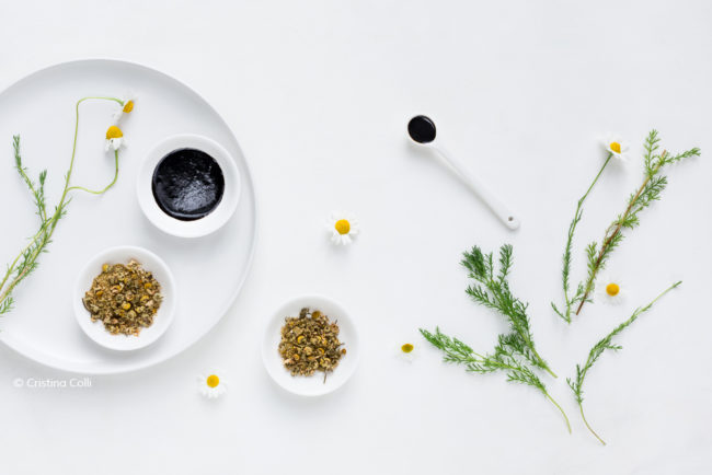
Styling each product was a pleasant, soothing, and beautifully scented experience – what with the lavender, chamomile, vanilla, and rose petals, just to name a few! A true multi-sensory experience :)
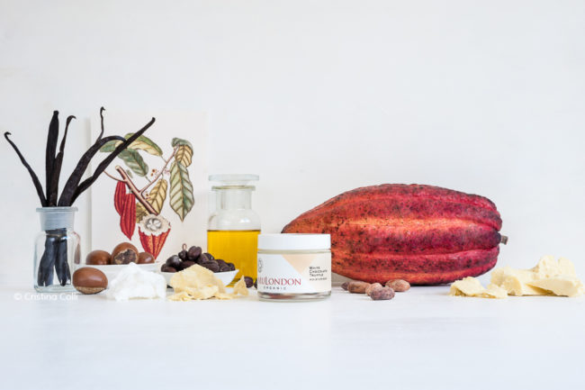
The White Chocolate Truffle moisturiser is so decadent, and smells so delicious, like having some white chocolate vanilla mousse right under your nose…I had to restrain myself not to taste it!
It’s been a real pleasure working with MuLondon. Head over to their new beautiful website to see all the images and learn more about their ethos and wonderful skincare.




Share On